Rob Zombie Art: Iconic Horror Illustrations, Posters & Dark Aesthetic Ideas
Rob Zombie has spent more than three decades building one of the most recognizable visual universes in entertainment, and his art is the thread that ties all of it together. Long before the platinum records and the horror films, Robert Cummings was a kid who drew monsters in the margins of notebooks and studied design at Parsons School of Design and Pratt Institute. That training never left him. Every album cover, film set, tour poster, comic book page, and merchandise design carries the same unmistakable fingerprints.
Rob Zombie art is not a side project or a hobby. It is the connective tissue of a career that refuses to stay in one lane. The severed heads on a gig poster, the rusted carnival trucks in a movie, the lurid orange-and-green palette of a record sleeve, and the tattoo on a fan's forearm all speak the same language. Understanding that language means looking at where it came from, how it is produced, and why it keeps pulling in new generations of collectors and creators.
What Defines the Rob Zombie Aesthetic
The core of Rob Zombie art is a collision of American pop culture and pure nightmare logic. Sideshow banners, county fair freak shows, 1970s drive-in B-movies, hot rod culture, and pulp comic covers get smashed together and rebuilt into something that feels both nostalgic and genuinely unsettling. Nothing is ever clean. Surfaces are scratched, edges are frayed, and colors are pushed toward sickly greens and bruised purples.


What makes the style hold together across so many mediums is its discipline. It would be easy for a carnival-horror mashup to turn into random noise, but Zombie's visual choices are remarkably consistent. He knows exactly which parts of mid-century Americana to preserve and which ones to rot out. That control is why a Rob Zombie record sleeve and a Rob Zombie movie still feel like they were pulled from the same world, even when they were made years apart by completely different teams.
Roots in Comic Books and Counterculture
Before he ever stepped behind a microphone, Zombie was a design student working his way through the trenches of production. He studied photography and film, worked as a production assistant on Pee-wee's Playhouse, and absorbed the commercial design sensibility that would later make his album packaging so striking. His earliest creative influences came from the printed page, particularly the horror anthology comics of the 1950s and the underground comix movement that followed.
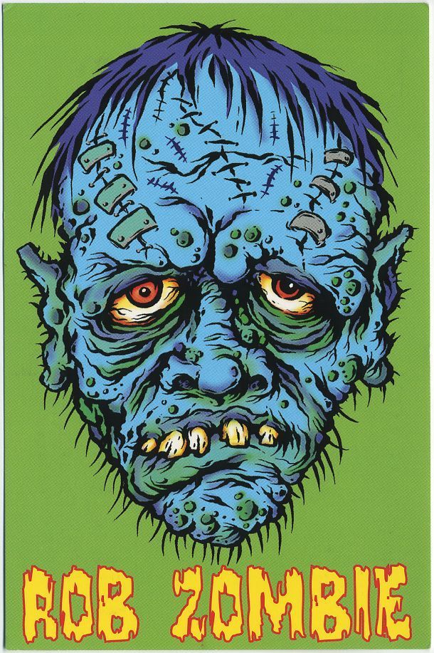


The EC Comics tradition of Tales from the Crypt and Vault of Horror taught him the value of a punchy composition and a moral twist. The underground scene, meanwhile, supplied the attitude. Artists like Robert Williams and the Kustom Kulture crowd showed that lowbrow imagery could be serious art without ever pretending to be respectable. You can trace a straight line from those influences to Captain Spaulding's leering face and the swooping, hand-painted lettering on a Zombie tour poster.
The Carnival Sideshow as a Visual Engine
If there is a single engine driving Rob Zombie art, it is the traveling carnival. Sideshows, tents, painted banners, barkers, and freak attractions provide a ready-made visual vocabulary that is theatrical, cheap, and deeply weird. Zombie uses that vocabulary constantly, whether he is naming an album after a psychic hotline, building a haunted attraction, or designing a stage show with giant mechanical monsters.
The carnival framing also gives him permission to mix tones that normally do not belong together. Comedy and cruelty sit side by side. A gag about fried chicken can lead directly into a massacre. Projects like The Haunted World of El Superbeasto lean fully into cartoon absurdity, while House of 1000 Corpses uses the same carnival signifiers to create dread. That flexibility is the reason the aesthetic never feels stale, even after decades of repetition.


Rob Zombie Art in Music, Film, and Print
Zombie's art direction is inseparable from the projects themselves. He has been deeply involved in the visual presentation of his music since the White Zombie days, and the covers for La Sexorcisto: Devil Music Vol. 1 and Astro-Creep: 2000 still look like artifacts from a parallel dimension. When he went solo, the packaging became even more elaborate, with Hellbilly Deluxe functioning as a full-blown statement of intent rather than a simple album cover.
The same instinct followed him into filmmaking. Movies are visual arguments, and Zombie builds his worlds from the ground up, from the grime on a wall to the shape of a mask. He works with long-time collaborators in special effects, illustration, and production design to keep the look coherent. The result is a body of work where a record, a film, and a comic book can share the same visual grammar without any awkward seams.
Album Covers, Posters, and Printed Ephemera
Record sleeves are where most people first encountered Rob Zombie art, and they remain the most collectible part of the catalog. The Hellbilly Deluxe cover, with its stitched-together monster and garish color scheme, established the template. Later releases pushed into different territory, with Educated Horses embracing a dusty desert-western feel and The Lunar Injection Kool Aid Eclipse Conspiracy leaning into psychedelic saturation. Each cover signals a slight shift in mood while staying recognizably on brand.


Beyond the official releases, there is a thriving world of screen-printed gig posters, limited vinyl variants, and gallery-quality art prints. Illustrators from the lowbrow and pop-surrealist scenes have contributed to that ecosystem, and the results often sell out within hours. Collectors treat these prints the way other people treat concert tickets, framing them, storing them flat, and hunting down the numbered editions they missed the first time around.
Film World-Building and Special Effects Art
On screen, Rob Zombie art becomes architecture. House of 1000 Corpses builds its dread out of cluttered roadside attractions, taxidermy, and hand-painted signage. The Devil's Rejects strips that away for a sun-bleached, grainy 1970s road movie look that feels like a faded photograph. Then 31 and 3 from Hell swing back toward saturated grindhouse excess. The variety is deliberate, and it shows how much thought goes into palette and texture.
A huge amount of that work happens before cameras ever roll. Concept art, prosthetic designs, storyboards, and set dressing all get developed by specialists who understand the aesthetic. Long-time effects collaborators have helped create the burns, masks, and creature work that define key scenes. Animated projects like The Haunted World of El Superbeasto required an entirely different pipeline, yet the design language stayed intact, proving the style is portable.
Collecting, Creating, and Commissioning Rob Zombie Art
Interest in this corner of horror art has grown steadily, and the market now spans a wide range of price points. Someone just starting out can pick up a reasonably priced poster or art print. Serious collectors chase original paintings, signed screen prints, production-used props, and one-of-a-kind commissions. Action figures and statues produced by major toy companies sit somewhere in the middle, offering a physical three-dimensional take on characters that were born as drawings.
What unites all of these buyers is an appreciation for craft, not just fandom. The people who spend real money on Rob Zombie art tend to care about line work, color theory, and print quality. They are not simply buying a logo. They are buying a piece of illustration history from a movement that has influenced tattoo artists, graphic designers, and independent horror creators around the world.
Buying Prints, Originals, and Collectibles
Anyone building a collection should start by deciding what they actually want. Screen prints reward patience because editions are finite and secondary prices can move fast. Original paintings or drawings are a different commitment entirely, requiring verification of provenance and careful storage away from sunlight and humidity. Signed memorabilia adds another layer, and authentication matters enormously in a market where forgeries are not unheard of.
A few practical habits go a long way. Buy from reputable galleries, official stores, or established artists whenever possible. Keep receipts and certificates. Store unframed prints flat in archival sleeves rather than rolling them. Insure anything valuable. New collectors who follow those basics tend to avoid the expensive mistakes that come from impulse buying at a convention after a long day on the floor.
Tattoos, Fan Art, and DIY Inspiration
Few modern horror aesthetics have infiltrated tattoo culture as thoroughly as this one. Captain Spaulding's clown makeup, the Rejects' mugshots, and the Hellbilly imagery translate beautifully into ink because they were designed with strong silhouettes and bold contrast. Tattoo artists frequently cite the high-contrast palette as ideal for skin, since it holds up over time better than subtle gradients and muted tones.
Fan artists and illustrators can learn a great deal by studying the compositions rather than copying them outright. Look at how negative space is used in a poster. Notice how a single warm color is placed against a field of cold ones to drag the eye where it needs to go. Then apply those lessons to original work. The most interesting emerging artists in this space are the ones who absorbed the vocabulary and started writing their own sentences with it.
Horror art keeps evolving, and the visual territory Rob Zombie mapped out over the last thirty years is still being explored by illustrators, tattooers, filmmakers, and designers who grew up staring at those album covers. Whether you are hunting down a rare print, sketching your first monster, or planning a sleeve, the work rewards close attention to detail. Start with a single piece that genuinely moves you, study why it works, and let that curiosity pull you deeper into the strange, saturated world he built.
Related Articles

Creepypasta Art: 30 Chilling Horror Illustrations & Dark Fan Drawings
Creepypasta art is the visual counterpart to the internet's darkest campfire stories: a sprawling, collaborative collection of illustrations, digital...

Graveyard Aesthetic Guide: Dark, Moody Style Ideas & Inspiration
The graveyard aesthetic is a mood, a visual language, and a quietly rebellious way of looking at the world. It draws from weathered headstones, iron gates...

Hanako Kun Aesthetic: Dark Anime Vibes, Wallpapers, Icons & Outfit Ideas
The Hanako-kun aesthetic is one of anime and manga’s most instantly recognizable visual moods, blending eerie folklore with soft, nostalgic beauty. Named after...

Evangelion Official Art: Iconic Illustrations, Posters & Design Archive
Neon Genesis Evangelion is one of the most visually distinctive anime franchises ever produced, and the artwork that bears its official seal is a major reason...

Child's Play Posters: Iconic Horror Prints & Collectible Wall Art
Child's Play posters are more than decorative horror collectibles. They document the visual marketing of a franchise that began with a single killer doll in...

Bob Peak Art: Iconic Movie Posters and Legendary Illustrations
Bob Peak art is the kind of commercial illustration that refuses to sit quietly in the background. With a career that stretched from the 1950s through the...